Create Content
Content Blocks settings options
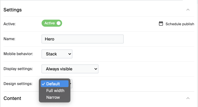
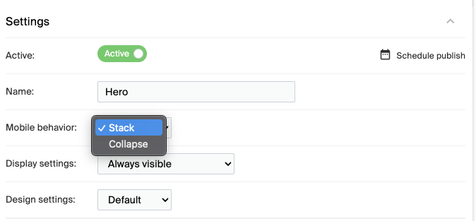
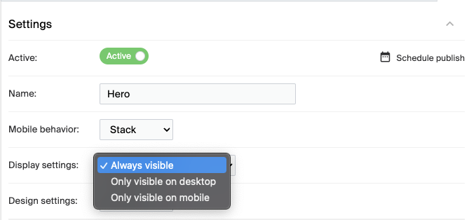
Each content block has settings for its name, mobile behavior, display, and design.
Key features
- Name each block for easy identification
- Set how a block behaves on mobile
- Control which devices a block is visible on
- Choose the block's design width
Every content block serves a specific purpose. Assign each block a meaningful name to manage and tell them apart, for example "Hero Banner" for a block containing a prominent banner. This is especially useful when a page has multiple blocks.
Mobile presentation
How a content block behaves on mobile devices:
| Option | Description |
|---|---|
| Stack | The default. The block's content stacks vertically on mobile screens to keep it readable. |
| Collapsed | Shows the block's content in a condensed form to optimize space. Must be configured during the initial setup of your system. |
Display preferences
Which devices a content block appears on:
| Option | Description |
|---|---|
| Always Visible | The default. The block is visible on all devices. |
| Only Visible on Desktop | The block appears only on desktop and is hidden on mobile. |
| Only Visible on Mobile | The block appears only on mobile and is hidden on desktop. |
Design configuration
The block's width on the page:
| Option | Description |
|---|---|
| Default | The block occupies the standard width of the page. |
| Narrow | The block is slimmer than the default page width. |
| Full Width | The block stretches across the entire width of the screen. |
How each state is displayed depends on the layout and configuration of your design.